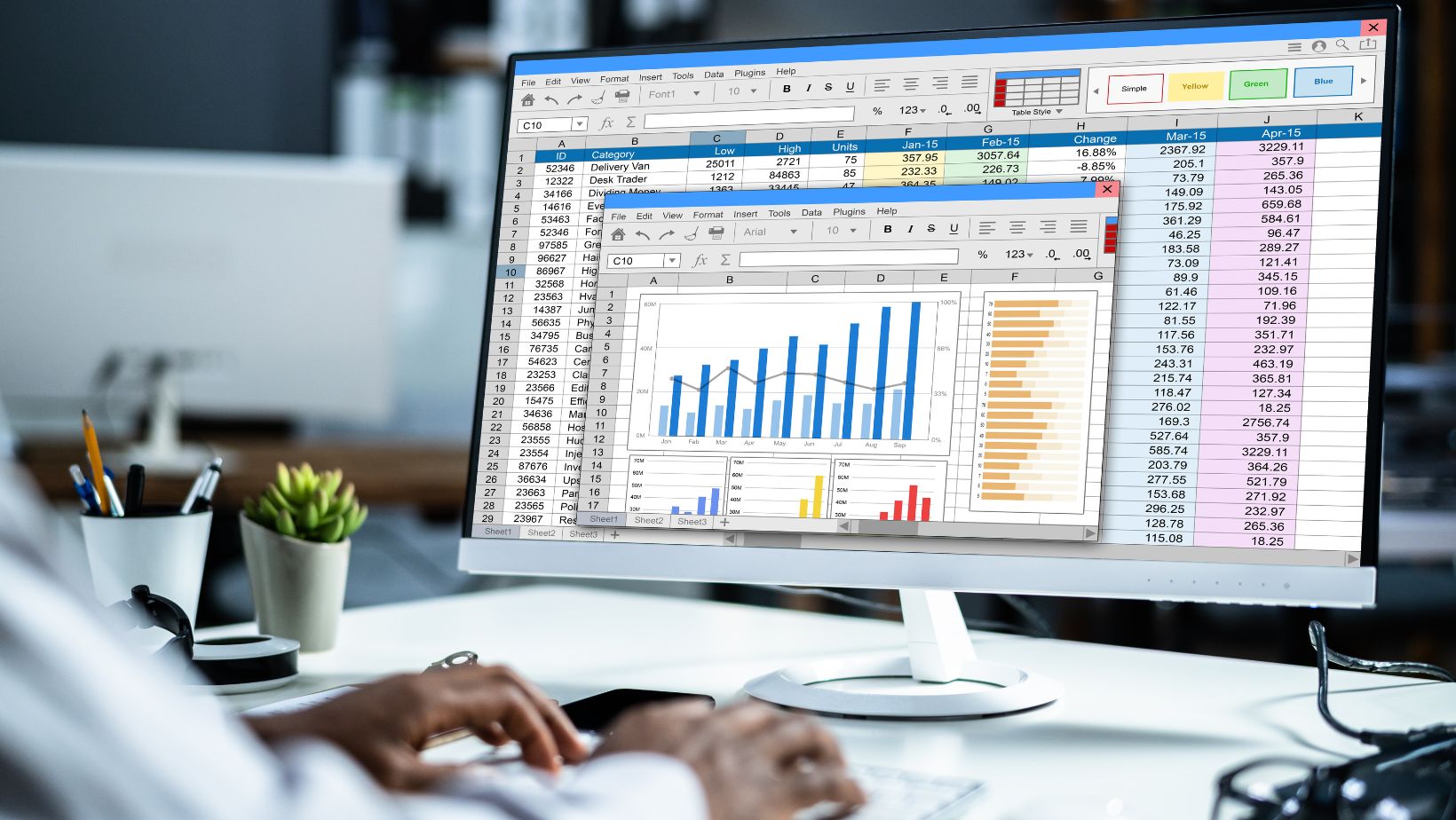
Yes, data dashboards still matter. You don’t need Power BI, Python, or a six-hour YouTube binge to make one that looks professional. In fact, most business owners and students can build a clear, high-leverage Excel dashboard in less than 30 minutes—if they think like a systems strategist, not a spreadsheet hobbyist.
The key? Stop decorating. Start designing for decision-making.
Step 1: Think Like a Strategist, Not a Statistician
Here’s where most people go wrong: they open Excel and immediately start formatting cells. That’s like writing your college essay before you’ve decided on your main idea.
Instead, zoom out and ask:
- What question will this dashboard answer?
- Who needs to act on this data?
- What’s the minimum set of metrics that drive real decisions?
Dashboards don’t win points for visual flair—they win when they shorten the distance between data and action. A test strategist would say: define the goal before you start the grind.
Example:
A small business owner doesn’t need 14 KPIs—they need three that matter: cash flow, conversion rate, and customer retention. A school administrator might want attendance, GPA distribution, and test-score growth. Everything else is noise.
Step 2: Build the “Input Table”—Your Data Source
Every clean dashboard starts with one rule: structure before style.
Create a raw data table that looks like this:
| Date | Category | Amount | Channel | Status |
| 1/1/2025 | Ads | 1200 | Paid | |
| 1/5/2025 | Sales | 3400 | Website | Completed |
| 1/6/2025 | Refunds | -200 | Website | Returned |
Why this matters: if your data is messy, your dashboard will lie. Excel’s analytics engine (PivotTables, slicers, and charts) relies on tidy, tabular data—every column a variable, every row a record.
Add a named table (Ctrl + T). This one click future-proofs your dashboard, automatically expanding when you add new rows.
Step 3: Define Your “Core Metrics Table” (The Testing Blueprint)
Think of this as your SAT study guide—the table of what truly counts. List the metrics you’ll track and the formulas that generate them:
| Metric | Formula | Goal | Signal |
| Total Sales | =SUMIFS(Data[Amount], Data[Category], “Sales”) | $50,000 | Green if ≥ Goal |
| ROI | =(Revenue – Cost) / Cost | 25% | Green if ≥ 25% |
| Conversion Rate | =LeadsWon / LeadsTotal | 10% | Green if ≥ 10% |
This step is like setting your “answer key” before you take the test—each formula aligns with a data-driven goal.
This is also the best place to teach your students or team members how Excel actually thinks. Insert “excel formulas and functions examples” right here to build literacy: show how SUMIFS filters, IF statements test logic, and AVERAGEIFS balances your dataset like a weighted GPA.
Step 4: Create the Pivot Power Core
Next, highlight your data and insert a PivotTable. This is where you turn raw numbers into insight.
Example workflow:
- Rows: Month
- Values: Sum of Amount
- Filters: Category or Channel
Then, add a PivotChart (Column or Line). Make sure you enable slicers—interactive buttons that let users toggle between timeframes, regions, or categories.
Pro tip: Use a PivotCache refresh shortcut (Alt + F5) to instantly update visuals when you add data. This keeps your dashboard dynamic and test-ready.
Step 5: Design the Dashboard Layout (The Visual Scaffolding)
Now, move to a new sheet titled “Dashboard.” This is your visual logic grid—every section should serve a purpose.

Divide the page into:
- Top Zone (KPIs): High-level numbers (Total Sales, ROI, Cash Flow).
- Middle Zone (Trends): Line or bar charts showing change over time.
- Bottom Zone (Details): Category breakdowns or best/worst lists.
Use shapes and consistent colors for clarity, not decoration. Brooke Hanson might say: “Your dashboard doesn’t need to be pretty—it needs to be persuasive.”
Color-code by logic, not emotion:
- Green = target met
- Yellow = watch
- Red = needs action
Step 6: Add Smart Indicators (The “Rubric” of Performance)
A good dashboard behaves like a grading rubric—it tells you why a metric is good or bad.
Example:
=IF(Sales>=Goal,”✅ On Track”,”⚠️ Below Target”)
Pair each indicator with conditional formatting (Home → Conditional Formatting → Icon Sets). This creates visual consistency across KPIs.
Now, add data bars and icons sparingly—think 3–5 signals max. Too many visuals dilute focus, like over-highlighting a study guide.
Step 7: Layer in Interactivity (Slicers and Timeline Controls)
To make your dashboard feel alive:
- Insert Slicers for Category, Channel, or Status.
- Add a Timeline for Date fields.
Align them horizontally across the top. These let you filter all PivotTables simultaneously—no code, just click.
The psychological effect matters: when users can toggle data dynamically, they engage more deeply. It’s like self-testing in prep—you retain more when you interact.
Step 8: Refine the Aesthetic (The Clarity Pass)
Use Brooke’s “clarity over clutter” test:
- Does every number have a label?
- Does every chart answer a question?
- Are colors consistent and meaningful?
- Can a first-time viewer interpret this in 30 seconds?
Change gridlines to white (View → Gridlines off), hide the ribbon, and set a clean font (Segoe UI or Calibri).
Add a short title and “Last Updated” note in the corner for credibility.
This 5-minute polish is your essay revision pass—it doesn’t change the content, but it makes the reader trust you more.
Step 9: Automate Refresh and Protect Data
Under the Data tab, set “Refresh All on Open.”
Protect the dashboard sheet (Review → Protect Sheet) so users can view but not accidentally overwrite formulas.
This step reduces spreadsheet risk—something business analysts and even academic researchers consistently underestimate. In studies, over 80% of complex spreadsheets contain errors. The fix isn’t paranoia—it’s systems thinking: build repeatable controls so data stays accurate even under pressure.
Step 10: Stress-Test Before Sharing
Finally, test your dashboard under real conditions:
- Add new data rows—does everything update?
- Filter edge cases—do charts and totals behave correctly?
- Check formulas for missing references or circular logic.
This step is the “practice test.” You don’t just build—you verify.
Example Timeline: The 30-Minute Build
Minute 0–5: Structure data, convert to table
Minute 6–12: Create core metrics and formula sheet
Minute 13–20: Insert PivotTables + Charts
Minute 21–25: Assemble dashboard layout + slicers
Minute 26–30: Apply formatting, QA, save version
It’s a sprint, but a strategic one—less tinkering, more thinking.
The Systems-Level Lesson
Dashboards aren’t about Excel—they’re about execution. The same way a top student creates a study plan that connects every practice test to an outcome, a smart professional builds dashboards that connect every metric to a decision.
If you remember one thing, make it this:
“Don’t track everything. Track what changes behavior.”
With that principle, even a half-hour dashboard becomes a daily coaching tool—for you, your team, or your students.
Takeaway Tools (Optional Enhancements)
- Free Resources: Microsoft’s “Dashboard Templates” gallery and Smartsheet’s KPI dashboards.
- Learn More: YouTube creators like ExcelIsFun, Leila Gharani, and MyOnlineTrainingHub—great for quick, applied builds.
- Next-Level Add-Ons: Try Power Query for automated imports, or Power Pivot for multi-table modeling once your basics are solid.
Final Thought
In testing and in data, confidence comes from clarity. A well-built Excel dashboard is just another form of score report—one that teaches you where you’re winning, what needs work, and how to adjust before the final exam of real-world performance.
Prep smart. Design with intent. And remember: the goal isn’t to make Excel pretty—it’s to make you powerful.


